Monday, April 25, 2022

Judge John's Dead End


It's been a while. Holding space for an essay about a new park in Oakland --if it loads OK from my mobile.


Thursday, December 31, 2020

Outro for 2020


Let’s sing out this year that has nearly expired us

To ward off inbound solstice gloom.

Having reaped our harvests of squash and virus,

Let’s harmonize, remotely, on Zoom.


No; let’s make this song do some conjuring.

Let’s sing up

more blue skies for Delhi,

a clean turtle island, 

a newborn queen,

(a washboard instead of this belly.)

Let’s belt 

hella ballgames

to stadiums full, 

Then be quiet while eelgrass and birds teach us 

wilderness tunes to leave gravity’s pull,

  queer lofty refrains without words.


Let’s yodel and yarn now and yammer all winter.

Write repair-songs for rifts made by tweet.

Come next fall may we all remove covid’s splinter

And together, with families complete,


Together with loved ones: sing sweet!

Dec 2020 Jen Mahoney 

Friday, April 21, 2017

Design Avatars

live lecture
Figures do so much more than indicate scale! They serve as avatars for the end-user, exposing non-optic features of any design, including those that address plant, soil and water management. Chris Grampp, author and co-chair of the Landscape Horticulture Department at Merritt College invited me to discuss my approach to using figures at Merritt's design forum. Keep it practical was his direction. 
For a spring afternoon, live watercolor sketching on the document camera and inviting folks to draw-along seemed appropriate. I had a lot of fun. During Q & A, someone asked how to draw dogs. I could only answer in relation to a human figure. (Proportion is so fundamental.) Fortunately, someone in the crowd knew dog anatomy and informed us that curvy part is the dog's knee. 

Wednesday, March 15, 2017

Matchstick Men and You

figures for design workshop exercise
weight-shifting of matchstick figures

A good group of designers has signed up for Figures for Design this month! My challenge is to identify and preserve each person's stroke style and give guidelines for proportion and level of detail. Everyone possesses a stroke style, whether they identify as being able to draw or not. Like other behaviors, stroke style can be discerned and incrementally modified. Above is one phase past paperclip people on the workshop's path toward identifiable figures that communicate ideas without drawing attention away from the design itself. 

Monday, March 13, 2017

Gullible Travelers

from bluff overlooking top of Alamere Falls, Point Reyes NP

Sunday. I persuaded a friend to do a 7.5 mile hike in Marin. I wanted so badly to get out after the rains and try these Daniel Smith pigment sticks that I mis-read the distance to Alamere Falls: yes, 7.5 miles --one way. I also failed to register the meaning 
of a dirt road lined with cars on the satellite picture. There would be crowds. 
We ended up picking over muddy trails, single-file with every other politically-traumatized and rain-fatigued local. More than enough hours had passed, yet we had no sense of being anywhere near the shore. I consulted the map and realized my error: we'd be taking our wintersoft bodies twice as far as anticipated. Deal! Doubling-down is in these days. As we neared what just had to be the descent to the falls, some of the earlier-risers were heading back, toward us. Our file stood aside and asked, How far to the falls? 
It's closed, a big dude answered. For a tired nanosecond, we long-marchers believed him! After all, for the past 4 months, we'd been sheltering indoors, hearing bad-upon-bad news. It's a National Park; could they...?? The landscape colors and the sounds of the Pacific beyond pounded sense into us. We chuckled sheepishly and marched on.  

Tuesday, February 21, 2017

Visibility and Virtuality

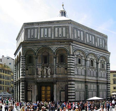
Lorenzo Ghiberti's Gates of Paradise, 15th c Florence, cast bronze

I get to geek out on linear perspective as a guest lecturer for Whitney Davis' proseminar in Art History. The first time I covered linear perspective among art historians, I suggested there may be no deeper reason to omit the more distant floor grid in this panel of Florence's baptistry doors than Ghiberti's lack of tinier tools. Tool size limits the depiction of space. Still true, even when the tool is modeling software. Why else would Pixar shell out for proprietary software? 
In today's burgeoning visual culture, glitches in spatial depiction arise, and we are so early to this game that we lack the shared vocabulary to describe themDavis sets out to provide terms we can use to talk about how people depict and relate to images and ideas of 3D space. He is deep into it. 
Today my goal is to persuade academics to draw simple perspectives and hope that through practice, they will sense the perceptive constraints one must accept to participate in this illusion...not unlike the beliefs we suspend when we pull on an Oculus headset. Regardless of tools & equipment, Ibn al Hazen10th c scientist and unwitting parent of linear perspective says the act of seeing may begin with light, form and eyes, but is only completed by the mind. That idea makes linear perspective more an interim translation of desire and less a stand-in for a deliverable product! 

Monday, March 30, 2015

Above It All


This classic Sesame Street video is a good plan-view earworm. Looking at a project in plan puts the viewer above it all. So do satellite pics. In paraline drawings, such as plan oblique or elevation oblique, their third dimension is added diagrammatically, without any convergence of depth lines. The lack of convergence gives the illusion that the back plane is bigger than the front. Figures can be placed in these paraline drawings, but constructing the context is onerous, with little payoff. On one project, the production team was persuaded to track their design process by means of plans and paraline views. There were some awkward surprises a year later when those who approved the project based on perspective presentations saw the final product. How frequently do we experience a space from above, anyway? Like plan views, paralines don't take you INSIDE. At the most they provide a superior, detached point of view. 
The blue wall is equally as wide as the orange wall in this elevation oblique
from Kevin Forseth. Optically, it appears larger.

Sunday, March 29, 2015

People in Design 5.0 - Paralines - between orthographic and perspective


western drafted elevation oblique        Japanese gyaku enkinhou visual narrative 
Some visual cultures embrace a different relationship to dimensionality. The gyaku enkinhou depictions of 3D space are like super-rich elevation obliques! I am very fond of this Japanese spatial depiction on scrolls, particularly with the device used to show interiors, fukinuki yatai, meaning blow the roof off. A scroll: what a thrilling means to unfurl an intimate story about very private figures in a highly stratified society! As early as the 10th c., such voyeuristic experiences accompanied spatially-depictive poems on scrolls and folding screens. They dwindled by the late 18th c., perhaps after heavy saturation of European linear perspective. See Suzuki Harunobu, who used fukinuki yatai, often with an isometric paraline structure in his many intimate ukiyo-e, popular 18th c. one-page poster prints.  

Friday, March 27, 2015

People in Design 3.0 - Try it on for size

materiality study at user touch-points
Master a believably proportioned, gestural figure, and you have a tool that does a LOT of work. Viewers more easily project themselves into the scene. Studying design ideas in elevation broadens the visualization process. It's efficient at showing depth via overlap. Rapid visualization by hand incorporates a different brain engagement than digital imaging, including sensed vibration of pen/pencil/brush across the page. I like to explore how a design fits together this way. Although I love perspective sketches, I use figures and annotations frequently to communicate with colleagues while a project is in process. The sketch conveys an informal, temporary state, encouraging continued participation of interested parties. 
rapid visualization of space plan variant in elevation


Wednesday, March 25, 2015

People in Design 2.0 - Elevation Storytelling

Paris, Bibliotheque Nationale, MS. lat.15158, fol.47. Dated 1289 CE.
13th c. mass media communication
Although merely 2 dimensional, figures in an elevation tell a more powerful story than figures on a plan. They become our avatars in a given scene, and interact with the built environment. This time-tested storytelling works for communication of design ideas, including landscape, lighting and context, without having to take on a 3D model or provide data in all 3 dimensions.
Ron Kasprisin watercolor presentation document
J.F. Mahoney ink and watercolor presentation document
Through suggestions of clothing and interactions, figures in elevation communicate cultural and behavioral information about who is using the space, and how.
  

Monday, March 23, 2015

People in Design 1.0 - Orthographics

John King, Jen Mahoney, Chip Sullivan
A couple weeks ago I was on a panel discussing people in architecture at the College of Environmental Design at UC Berkeley. It comes up again and again in design presentation classes. To the adult student who gave up on drawing around age eight, getting comfy with perspective sketching is a challenge; add figures to the mix and it's double jeopardy! Yet despite the predominance of plans in design development, instruction for drawing our fellow humans in plan is rare! We draw 'em like we see 'em. In elevation.  Some figure-drawing guidelines over the ages are below. What's not specified here is how they relate to one another, or to whatever the visual field represents.
Proportioning parts of the body to the whole are a physiological constant. Size of figures in relation to one another changes with the beliefs of the culture that depicts them. Gods big; slaves small, etc.


Monday, March 16, 2015

Above it all 5.0 What are those tiny things?

Detail, plan view of San Francisco Ferry Building
Figures in plan may cause the viewer some confusion before the scale effect sets in. We don't often perceive our fellow humans from above. To get a sense of scale, we'd do better to gauge the size of this place using what seem to be tables and chairs. Cluster them at entries, around new information in plan or at featured design elements. Evenly spaced they may seem like texture. In the plan below, word labels and figures help tell the story of the activities in the space. Where the figures overlap shapes, the viewer also gauges heights of objects overlapped by figures.
Edible Schoolyard plan ©J.F.Mahoney
Proposed Dining Commons for Edible Schoolyard Project

Friday, March 13, 2015

Above it all 4.0 Pairing it down


Let's get down to the workhorse signifier in a plan: lines.

1. Most abstractly, line in a plan makes a feature distinction between one side and the other, the way in linguistics, a single audio shift (vocalization) makes the difference between pear and bear
The bottom distinctive pair is crucial info for an Embarcadero-Telegraph Hill trip.
2. Lines on a plan describe boundaries that will mediate movement and transactions. Like a sieve, a stairway, or a speed-bump, those boundaries affect access to visual, acoustic and spatial events. The flow and behavior of weapons, vehicles, valuables, germs, and creatures, including people are mediated. Line thickness and continuity convey meaning, too. 
The nature of the boundary remains ambiguous until third-dimension data is supplied, usually via elevation, section, annotation or a perspective drawing. 
Student work addressing access & transaction boundaries at a grocery store.
For environmental design, considering plans through these abstract lenses helps to focus on problem-solving without being distracted by particular products or finishes. Next post tries out the most common connector an image makes between viewer and design.

Wednesday, March 11, 2015

Above it all 3.0 Anonymity and Superiority

Screen shot of ©Google Maps view of SF. Scale bar on lower RH side. 
The viewer of a photo is automatically placed in the position of the camera; however, an aerial photo is an extreme variety. It foreshortens the height dimension so much that the image resembles a plan. Viewers feel above it all without feeling specifically located, similar to the anonymity 2D plans provide. Like plans, aerial photos also require additional help to effectively communicate spatial relations. Tourists who plan an easy walk from Levi's Plaza west to Coit Tower, will get a message from their bodies about what data is missing on the satellite pic above! 
Anonymity, disengagement and superiority: some of the emotional color an aerial shot or a plan provides.
West to Coit Tower from Levis Plaza
Greenwich steps looking down & east


Monday, March 9, 2015

Above it all 2.0 Can you relate?

                         photo courtesy Belle Marko

How about photos, then? Do photos work for maps? For communication of design ideas, sharing a photo does not guarantee mutual understanding of the subject depicted. Depending on the desired outcome, one may have to add –or subtract– elements to make a story clearer to an intended audience. This photo elicits my awe and admiration for the engineering of the Golden Gate Bridge. It may not engage the Egyptian brick-maker from the last post. He may have never seen a sea from on high, nor would he know that each of those light blobs can carry a family of six. What would he make of this image? If one could reach across a 3500-year culture gap, what addition to this image would tell the brick-maker what's going on in this photo? 

We think of photos as carrying real information, because a camera reports everything in its field of view. Sometimes that's no help. The same view in fog, at dawn, or at high noon looks very different. A photo is merely a flat extraction of 3D data, whether taken from a satellite, a roaming van, or the end of a laparoscope. It's an abstract field of texture and color, unless it indicates scale or depicts a familiar item that gives the viewer a sense of his or her size in relation to the scene

I'm glad my GPS doesn't send me "real" aerial photos for navigation! It reduces visual data to fewer colors, some arrows and scale indicators, and I can quickly choose a path.  

Friday, March 6, 2015

Above it all 1.0 Missing info

incised clay fragment 13-14c BCE map of Nippur (in Iraq)
Maps (plans) show how one piece of real estate is related to another. They typically show 2 dimensions. This worked to describe space for thousands of years. It's fun to look for ways image-makers have tried to weave in a third dimensional matrix into a plan view: height, the future, the afterlife, kinship or social hierarchy. We invented all kinds of systems for representing a 3rd dimension! Where we can't know the hierarchy between objects in images from distant times or unfamiliar cultures, we can only speculate why an image was created. Below is an early representation of all 3 dimensions around a body of water. 
The Garden, fresco from Nebamun tomb, originally in Thebes, Egypt, now in the British Museum, London, U.K. Painting on plaster, 72 x 62 cm.
In a similar image-type, we read depth cues in the overlap between human figures, shore, water, and pottery for a short visual narrative about extracting something from the pond. See below.
Nina de Garis Davies' reproduction of Rehkmire Tomb image,1500-1200 BCE


Wednesday, February 4, 2015

Fitting in


Survival, the other end of the spectrum from Creativity, has a relationship with Resilience that compromises the body.
In my work drawing concepts for teams at different companies, I've had the opportunity to observe and participate in creative dynamics. Drawing pictures is nice. The interpersonal stuff makes it very exciting. Even if a launch fails, that hive energy begets creative, proactive attitudes. Over the years, teams spin off smaller units. Some go way outside the mothership. Resiliency is good for the body and for business. 
Sometimes, due to pressure from non-creative partners or free-floating fear, teams stop being proactive. Maybe a deep yearning for predictability, rooted in survival is speaking. A few seasons of success lend the impression that any project can be planned and executed in Excel-type fashion. That works when the spreadsheet has columns named re-frame and reality checkand cells named unknown and epiphany
Our new holy grail is the program that tidily snaps those categories on a spreadsheet. One of Resiliency’s tight friends is Creativity; both resist the matrix. 

Wednesday, January 28, 2015

The long goodbye


charcoal and conte crayon
The continuous dry ground from summer into winter is a bonus for outdoor sketching; Pyrrhic advantage. I returned with charcoal to the dying pines on the Ridge Trail nearby. I take pics or draw ‘em. Their dying is such a long process! They are stark, magnificent --yet hard to identify with as a role model for dying. It's not Hollywood's one big bad scene, it's a years-long indignity, visible from all sides of the ridge. Bark slips off at a near-geologic pace. A broken limb catches on its ailing neighbor. Eventually the neighbor goes down.
Last year, I hung several of these trees’ portraits downtown alongside portraits of the Palace Hotel: Wealth, two ways. SF architecture drawings sold; dead trees – not so much! Back to drawings of built space, happy customers, coordinated materials. The hired pen wants to wander. 

Wednesday, January 7, 2015

Not as Advertised


The weather reports said no snow, so it was unusually crowded for after-Xmas. Day-visitors in flip-flops. This is year #4 of drought. Yhe falls at Yosemite were reduced to a trickle this January, a glaze of frost on an adjacent ledge. NPS' foreign guests will post selfies of this and buy postcards of the falls the way they used to be. My plein air excursion happened, but what a sorry sight. 

Tuesday, June 24, 2014

Let's hang on


My son and his day-old son
I am overwhelmed and speechless. I can only sing to him.