
Wednesday, May 30, 2012
why didn't I think of this?

Sunday, May 27, 2012
this bird has flown

Clacking of tiny feet on wood
A soft rap on the flatmate's door
The startled peal of parting tears
Cut short by stiff upper lipness.
The shuffling of thrice her volume
Swiftly down 3 runs of stairs, and
Up for one last, squeaky valise.
Then a pause, while the taxi idles:
Last gaze from the edge of this nest.
Wednesday, May 9, 2012
Framing techniques

I'm outta here!
This scratchboard made for Marley Lynch's 3rd birthday is my first Sendak-inspired image that came to mind after hearing today's sad news. Goodbye to Maurice Sendak, who passed yesterday morning at 83. His phrases run through my mind every week: "Milk! Milk! Milk for the morning cake!"In a clutch of radio interviews compiled by WHYY's Fresh Air to commemorate his passing, Sendak recalls being a sickly child in the years before vaccines and antibiotics. He spent much time in bed. To pass time during visits, his grandmother would close, then open the window shade for him, to great theatric effect. Mundane scenes of Brooklyn were enhanced by that prelude of anticipation. "The window became my movie camera, my television set." Can you imagine a better way to imprint a framing technique for illustration on a young fellow?
When Sendak chooses to employ depth cues, his volumetric worlds are rendered to the flat page so believably, giving great depth to landscape as in his "decorations" for Randall Jarrell's The Animal Family. Other views, like the party scene in Where the Wild Things Are, compress depth to a claustrophobic sliver. A master of narrative, whether a band header or full-page embellishments in dense pen and ink, Sendak enchants readers to lose themselves in each frame. Children do this very easily, but Sendak's spell works on grownups, too. I suspect all the childhood window-watching gave him a lifelong ability to climb into the frame and report back to us.
Saturday, April 7, 2012
blowing Brunelleschi's cover

A student made an excellent observation Wednesday night. After trying to correct a freehand sketch of a scene using new-found perspective tools, she remarked that her initial sketch felt more like the space as she experienced it. The line quality in the first sketch was personal and idiosyncratic, recalling the sensitive lines she generated during blind contour exercises. The "cleaned up" drawing was more like an Etch-a-sketch image.
Anyone who has lost happiness based on a misunderstood email knows that a low-res, virtual, electronic form of communication is full of pitfalls. So much more is happening than what those few text characters convey. The same is true when describing on flat paper a design idea that's to be experienced in the 3D environment.
Linear perspective is only one means of translation, one that has been dominant for centuries. If you've done a perspective construction, you know it's nothing like sketching with a pad of paper on your lap. Much that we have assumed to be highly skilled perspective constructions may in fact have used another translation mode, one that may have seemed more technically accurate at the time. Here is David Hockney refuting the accuracy of single-camera perspective! Here, a Japanese image provides a comprehensive spatial narrative by other means. If you want to look further, here is Hockney as Toto, pulling away the curtain that (he alleges) hid perspective's Wizard of Oz for 600 years. Consider the "rules" of perspective more as tools, or guidelines, for translating an optical experience that occurs in 3D, over time, onto a flat surface.
The means we use to come up with what "feels" faithful to a visual experience today may also carry a message about our relationship to technology at the time of translation.
Sunday, March 18, 2012
Absolute Beginners of SU.
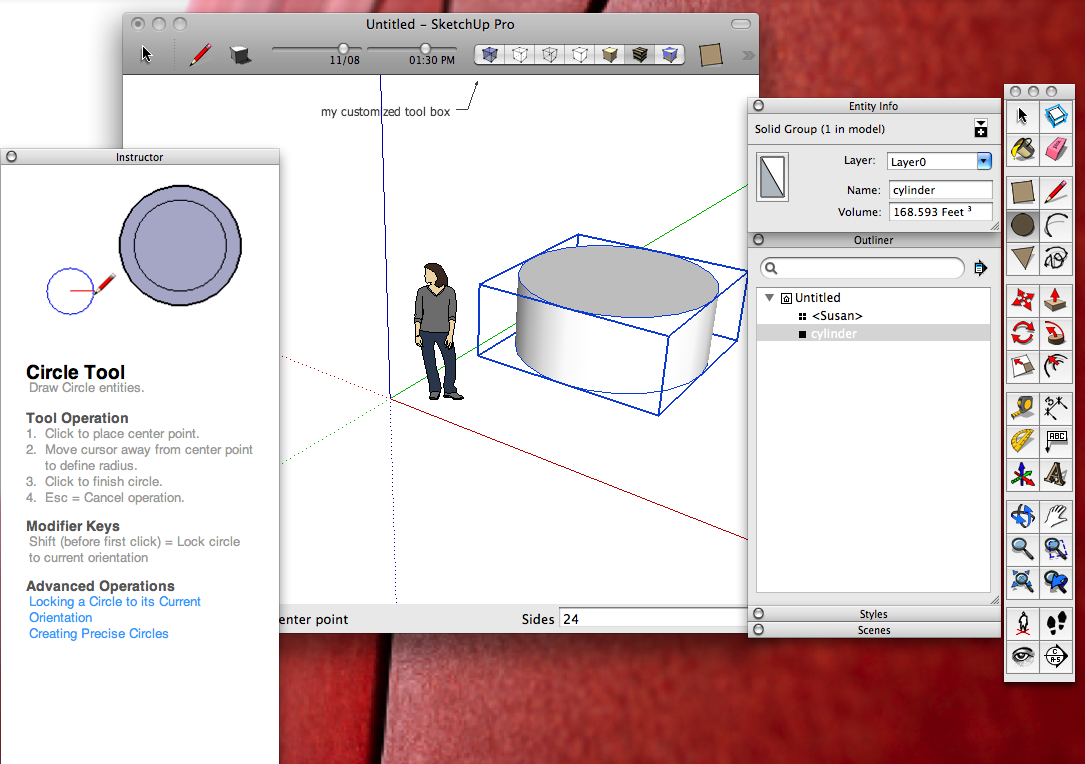
A plethora of tutorials exists online and it's easy to get sidetracked. I recommend tutorials by Aidan Chopra, Trimble's charismatic blogger and author of SU for Dummies. Any tutorials from SketchUp are helpful, esp if you take them in related groups, in small doses. There's a cluster of SU Basics called the toolbar series that takes you thru the commands, tool by tool. Pictured is the large tool set, the fat crayon of SketchUp.
1. Make the GUI style to your liking! At the boot-up window, I recommend the engineer's template over the others, or one that has the ground plane lightly toned so the horizon always shows. You can change SU's default color backgrounds and fat profile lines.
2. SU has a dialog box called Instructor, activated under the window menu. Several of my students got up and running with that alone.
3. Keystroke commands are worth printing out and learning from the git-go. Tool modifier keys are suggested by Instructor.
4. Once you start modeling, the first thing is to figure out how to keep things from sticking to each other by using groups. command G
5. Keep it simple. Make simple shapes, group often, alter and arrange groups smoothly, size them; then create and save views. Beginners: avoid the black hole/time sink of snazzy Google Earth functionality, picture matching, or pouring on SU's factory-made texture/colors, and you'll learn fast. Components can come later. Better to make good shapes and learn how to organize and manipulate them deftly before having them jump hoops or wear gowns.
6. The instant you learn groups, you have the opportunity to acquire a great habit: name each group (entity info box) and watch where SU puts it in the Outliner box. Every extra second you invest in doing that will be repaid sevenfold later on, so start the habit NOW. The Outliner box is key to efficient modeling. SU has LAYERS*. Do all construction in Layer 0. See tutorials on this. Outliner is sitting there just waiting to show off its stuff.
7. Learn to use the inferencing function (no key to press, it's always there -- at times a little too eager to help)
8. Sketchup is vector-based; just points, lines and planes. Look for the green end points. They count for more than they appear to.
9. Soon after you fall in love with SketchUp, consider buying the pro version. Its cost is a fraction of the competition's. The Pro version shakes hands with far more colleagues & includes nifty document-production functionality in Layout.
Everything I mentioned appears in the pic above except for the boot-up window and the green end points.
*layers' functionality is different, and useful, but less so for the beginner.
Monday, July 25, 2011
observing one's dominion

Many designers like to feel on top of their projects, virtually and figuratively. Using images like this during design development might work for office politics or designer-builder relations, but what end-user ever encounters a building from this angle? Once it's approved, it's a little late to say "Gee, the parapets seem out of proportion." The project above ended with a comic compensation for such oversight.
3D modeling is now so well-embedded in building industry software, it's easy to periodically examine a project from the user's eye level. If true perspectives are not possible, track a project via elevation, perhaps with figures for scale. Elevations may miss the dimension of depth, but they approximate the user experience more accurately than the above type of view (isometric paraline.)
A designer should know how to request a specific view from software. It's important for design students to understand the basic geometry of linear perspective, since any 3D modeling software is built on classic geometry. At least for now.
Wednesday, July 6, 2011
urban geology

 |
| Charles Dilworth, architect@STUDIOS. Gravel by Ma Nature |
Subscribe to:
Posts (Atom)