Showing posts with label examples. Show all posts

Tuesday, September 21, 2010

visual note taking B

3 variations on a single application of a window to a kitchen; watercolor

Assignment: Observe three different window styles. Take note: How deep is the wall in which the windows are set? (thumbnail section) Is the glass closer to the interior or the exterior surface? How high above the floor is the bottom of the window? (thumbnail elevation w/human figure) How is the transparency adjusted (curtains, blinds, shades, film, etc)? How is the adjustment made? Can the window be opened or closed? How? Minimal annotation is encouraged.
All VNT must include thumbnail plan & section/elevation as well as a site sketch.

Wednesday, July 15, 2009

freehand exploded plan oblique

A freehand exploded plan oblique sketch made with layers of trace and printed using ARC Reprographic's old-school, blueprint machine before they sold it for scrap! Now this look is available on the styles menu of Sketchup. Using its line style menu, one can probably get this hand-made feel as well! 
This project is on 16th Street at the base of Potrero Hill in SF, renovation of a deco-style building. A helicopter lowered the space frame into the roofless, squat "tower" of the building at the crack of dawn one cold morning. The resulting sandstorm of urban street grit wrecked all our film cameras.

Friday, July 3, 2009

fresh, green, organic, unprocessed


Those were some of the keywords of a look-and-feel assignment for a retail food service client. The job was not to redesign the store (in-house designers would do that) but to create a visual from those keywords in an overall impression of the store. Vague direction, vague pictures. Fresh blood for the design crew. Happy job.

more on fog


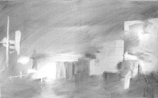
How pleasant and mysterious it is to pull a perspective drawing out of charcoal-rubbed fog. For some reason, I had the presence of mind to document a few steps in this concept sketch for a Liz Claiborne retail interior. My favorite is the first one. Shoulda stopped there, although I like how the light firmed up in the third.

Wednesday, October 8, 2008

b/w interiors

Per student request, here are 3 black and white interior perspective drawings. Click on an image to view slightly larger. charcoal pencilink and marker
Images ©J.F. Mahoney, all rights reserved.