Suffice to say that the back end of the Ox is moving through and soon it will be gone. 2009 will be a year to remember for shedding light on the talismans of life that I used to fondle in the darkness of my pocket. Time to clap hands and sing and louder sing for every tatter in this mortal dress.
Saturday, December 26, 2009
Thursday, August 27, 2009
make do
 A young French nutritionist was in my kitchen asking for a food processor. We don't have one, and I told her she'd just have to make do. "Make do"? How is that expressed by the French? Improviser. When confronted with less than optimal circumstances, most humans will fashion tools from whatever is at hand. Folks seeking employment in the 30s arrived at the desert canyon of the lower Colorado to work on the Boulder Dam. Unemployed, European-trained craftsmen created terrazzo floors with Native American-inspired patterns, fashioned hundreds of cubic feet of copper cabinetry and machined colossal valves and fittings in exchange for a pull on these big, concrete teats. Despite heat, primitive living and scarcity of everything but rocks, these workers were making do, big time. And so were their bosses: Kaiser, Bechtel, et al.
road memoir#3
 Leaving Arizona on US 93 brought us down to Black Canyon, an area that, save for the Colorado River at its bottom, is seemingly all rock and bereft of water. It's so close to the expanding basin-and-range province that one is easily disoriented by the pull of seismically-warped gravity. It just feels different there. We crossed over the Hoover Dam, an ambitious engineering design built under extraordinarily brutal economic and climatic circumstances. In this desolate corner, how celebrated can such a structure be? Can something requiring such calculation and cooperation be an unembellished industrial object? Or is it crafted to make our spirits soar? We crossed over and sketched for a while from a pullout halfway up from the dam road. I was a goner! I made this drawing and swore to come back and draw the whole thing, inside and out. The next year I did.
Sunday, August 23, 2009
are we there yet?
 In its useful, static role, the horizon is an arbiter of space; assign it a numeric value in a perspective drawing, and one can draw in objects with believable proportions. In its metaphysical role, it's a tool for reflection to an observer. Go deeper: it's the edge of time on which we balance as we walk our lives, unrolling and revealing what only time will tell.
One summer dad drove us from Chicago to San Francisco on the not-finished Interstate 80 in our new Chevy. We were going to see mountains and ocean. My 5 yr-old flatland eyes trained on the horizon, waiting for the Disney-esque or Chuck Jonesian butte to appear. Every time my attention stalled, I'd ask "Are we there yet?" Poor mom and dad! That summer, horizon became linked to yearning: constantly there but out of reach, withholding but promising new information. We hurtled to California, toward our futures.
Thursday, August 20, 2009
road memoir #2

Elevation/defense. We scramble to a hole in a high wall to get away from danger. We build walls as monuments to our separateness, our vulnerability, our superiority, their madness, their sociopathy. I wondered what forces carved the shapes out, the forces that create Negative Space. The picture got really big for me, and the time line was geologic. (took years to follow up on that) In the meantime, we noted how things were not really so empty. There was the Desert Version of everything:

road memoir #1
A friend and I met in Phoenix for a Western road trip in the early 80s. Here are my best shots of his Heitzness. He had a pickup, sketchbook, knife and movie camera. I had an SX70, sketchbook and garlic press. He possessed exquisite visual filters which recharged at the Flintstone Motel and fed on reptilian souvenirs. I hadn't yet marked spatial relations as my turf, but curiously, the most potent stops for me had everything to do with elevation, horizon line and engineering.
Monday, August 17, 2009
"look what I had to work with"
 I like to use concept sketches early on, when data and design are often incomplete. Sketches align expectations and solicit approval among any number of stakeholders. Their rough nature says, "work in progress." They invite input and allow flexibility going forward. Sometimes this quote from the 1989 Batman comes to mind when a client's expectations are too high. It's a thrill to promote a unified vision based on data from varied sources, and to follow a project's development until it goes to bid. Save the full rendering for when project data, modeling tools and time are available to truly solve the design gaps. A renderer may find the archive of hand-sketches helpful to make a finished product.
Thursday, July 30, 2009
vanishing point in the sky
Friday, July 24, 2009
gimme scale 2
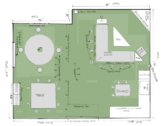 Take a look at this floor plan. Absent close reading, it seems like a nice idea. Once in the door (at the bottom,) one can choose between watching some big-screen content in the lounge/snack area at the right, or sitting down at one of the tables at the left. The smaller spots on the floor must be the chairs.
This document does give information about scale. Someone had dutifully measured the room and the bookcase and notated it on the plan.
However, someone else decided what the room would contain, and without looking at the size of the wall on the plan, sketched out their idea while engaged in some wishful visual thinking!!
When they called and sent me their plan sketch, I looked at the relation of furniture placement first. I, too, began to visualize a room based on what the rectangles-as-furniture recalled from my mind's cache of Lounges I Have Drawn...until I checked the tiny size annotations. The dream ended quickly. My client awakened a different way when they visited the actual space, and phoned in a panic, "I just saw the site -- it's TINY!!!"
If one looks closely, the room has less than 130 sf. If all that furniture were to fit in the room, the largest of the chairs would have a 5" seat, and the sofa would be less than one foot deep. Bring in the dwarves...
Monday, July 20, 2009
annotation
storage rods for Mother Jones
illustration, ©J.F.Mahoney
A bright young electronics engineer is in town for conferences and study. He and his colleagues design and create objects that can only be seen with an electron microscope! A different kind of virtual viewing, this tiny 3-dimensionality! I asked him if he takes notes on his laptop or on paper. He said back in Japan he takes notes using a keyboard, but here in the US, he started using pencil on lined paper while he was first settling in, because his baggage was delayed. When he reviewed his handwritten notes, the thinking provoked by seeing his own handwriting felt "more creative". He decided to take notes by hand the whole summer.
Thursday, July 16, 2009
reversal, relapse
Wednesday, July 15, 2009
freehand exploded plan oblique
 A freehand exploded plan oblique sketch made with layers of trace and printed using ARC Reprographic's old-school, blueprint machine before they sold it for scrap! Now this look is available on the styles menu of Sketchup. Using its line style menu, one can probably get this hand-made feel as well!
 This project is on 16th Street at the base of Potrero Hill in SF, renovation of a deco-style building. A helicopter lowered the space frame into the roofless, squat "tower" of the building at the crack of dawn one cold morning. The resulting sandstorm of urban street grit wrecked all our film cameras.
beautiful book
 In addition to the mysteries made visible in this Vince Collins spot, another early influence for me was exploded illustrations of mechanical parts, cars and engines. My dad worked for GM and car imagery was never far from reach. In the early part of my career, I had the pleasure losing myself in the making of these, both ruled and freehand. The best were for Austrian architect Hanns Kainz'projects.
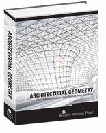
At the AIA convention this spring, I perused a doorstop-weight tome called Architectural Geometry from Bentley Institute. It's a geeky delight, full of complex shapes reduced to their pure geometry and made 2D visible. Thanks, digital age! That really scratches an itch.
Tuesday, July 14, 2009
reversal
Saturday, July 11, 2009
scale, proportion
Friday, July 10, 2009
more deep questions
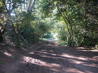 Is this more deep than the last photo? Just because of the trail width? The bike tracks? These scenes are hard to translate to the flat surface in a drawing or painting. Is so much foreground necessary to draw attention to the far distance? What we see in this photo is already an optic translation of 3D to 2D. It doesn't convey how "deep" this felt to me as I experienced this space. As a means for discussing comparative sense of depth in 2D, this photo works.
non-linear perspective questions
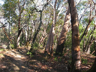 Can you imagine how it might have felt to think about recording, narrating or depicting places of importance or sentimentality before there were railroad tracks or engineered walls? It's tempting to think what cave paintings might tell. Despite there being nothing linear in this photo, it still has depth cues. Could one formalistically seek depth cues in ancient images? Let's not go there today.
Monday, July 6, 2009
depth cues
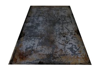
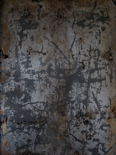 Seen flat, it might be a painting from the 1950s. When given a minimal depth cue, it might be sculpture from the late 1970s. Or a cookie sheet.
Sunday, July 5, 2009
when it rains, it pours
 The current batch of perspectivists at UC Extension recently reverse-engineered some photos. Reverse engineering is the process of analyzing a subject system to create representations of the system at a higher level of abstraction. A photograph is a representation of the system of perspective construction. The camera uses a station point, line of sight and picture plane; it has a field of view and focuses along a line of sight. These geometric abstractions are common to both perspective and still photography. Our perspectivists located abstract components in the photographs and roughly sketched out plan versions of the scene the camera most likely faced.
Google SketchUp simulates the same kind of reverse engineering on photos to get them to merge their represented reality into the virtual reality of SketchUp. The programmers then had to find a way to make visible the abstract components WITHIN its 3D modeling software, since the software itself, being no more like sight than photography, is a representation of the system of perspective drawing. Looks a lot like the perspectivists' work!
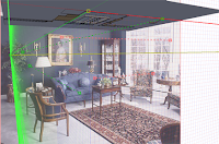 The whole process reminds me of staring at the rainy-day illustration on the Morton Salt container. A girl was holding an umbrella and a container of Morton Salt, which had the same illustration with a smaller girl, smaller container, with yet another illustration of a girl with an umbrella and an illustrated container. Or so I imagined.
Saturday, July 4, 2009
Friday, July 3, 2009
fresh, green, organic, unprocessed

Those were some of the keywords of a look-and-feel assignment for a retail food service client. The job was not to redesign the store (in-house designers would do that) but to create a visual from those keywords in an overall impression of the store. Vague direction, vague pictures. Fresh blood for the design crew. Happy job.
more on fog
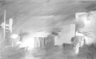


How pleasant and mysterious it is to pull a perspective drawing out of charcoal-rubbed fog. For some reason, I had the presence of mind to document a few steps in this concept sketch for a Liz Claiborne retail interior. My favorite is the first one. Shoulda stopped there, although I like how the light firmed up in the third.
Wednesday, July 1, 2009
wetmosphere
 |
| 2009 LHS webcam vs. 1845 Turner sunrise |
Thursday, April 30, 2009
desperate private space
The AIA convention is in our town. My job was at the sketch tour of the Ferry Building. 30 people "signed up" to spend the morning sketching outdoors in perfect weather! (Twist my arm!!) Around 3pm in the windowless convention hall, many of the folks staffing the exhibits were drooping. One exhibit had a good-looking, thick storage wall, spacious enough to hold all their supplies...and a cat-napping employee!
Thursday, April 23, 2009
long lost geometry

B Baker was in town this week and we talked about phantom bikes, as in phantom limbs. He does a double-take whenever a bike goes past that looks like the Bianchi he lost 30 years ago. In my university town, bicycles are all over the place, like visual static. My trusty Diamondback served me for 20+ years until it was stolen. 2 years later, as I was leaving a bookstore, the familiar frame geometry of one parked bike jumped out from the static. An identifying repair weld on the frame confirmed: MINE! And unlocked! What strikes me is that 2 years after the loss, a particular frame geometry was seared in my memory, like the silhouette of one's beloved.
Thursday, April 9, 2009
too much geometry?

A friend and I went to see Kanna Aoki's paintings last night at Brit-Marie's cafe on Solano. I've seen Kanna's work in life-drawing classes over the past 7 years, but only recently saw one of her street paintings -- on a note card! These paintings might be from photos; they feel well observed, with metered emotion. I particularly like the freeway scene with the reflective rear-end of a tanker. (How many times have you wished you could take a picture in that situation, except that you're driving at least 55mph?) The ghost of the painter of modern life appears in her triptych composition of a laundromat. Best in show. The friend knows Kanna, and said she had struggled with perspective of the rows of circular windows on the washing machine doors. I said I could show her how that works in perspective. But why?? Geometric accuracy is useful, but not always an enhancement. Truth is, I prefer how the authentic struggle is evident in the painting. In this case, close looking and confident handling of paint and color trump geometric accuracy.
too much geometry

This small re-do of the curbside garden next to a church reminded me of the wisdom of the late Nancy Sullivan, horticulturist, environmentalist and educator. Liz Wing helped me get time away from the parallel-rule and computer programs to build a couple raised beds outside my kitchen. Nancy had urged us to get a worm box a few years earlier for good soil, and I wanted the vegetable planting to be just right. I called Nancy and asked her if the rows should run north-south or east-west. Her response: "Why do they have to be in rows?"
Thursday, March 26, 2009
man vs. machine
The increasing speed of 3d modeling software challenged me to read plans and drill into to the heart someone's design ever faster. But a John Henry-style characterization doesn’t seem valid. Handmade alone may no longer be time-efficient, but digital alone doesn’t feel humane -- feel, not look. The richness and emotional appeal of illustrations that employ a hybrid of techniques should be an encouragement to designers as well as illustrators to employ the best of both modes. It's surprising how few people knew the blend of myth and history around John Henry, that steel-drivin' man. Just the name starts a song in my head. Here's a radio clip on John Henry from Studio 360.
spring fever
Thursday, March 5, 2009
what's wrong with this picture?

At lunch the other day, an urban developer pondered, "What's with this designing on computer? I call our architect to ask what his thinking is on the changes we're making. He sends me a computer drawing. All I want to see is a sketch, a drawing of the facade! We're not getting anywhere."
What's wrong with this picture? They both want to move the design along. The developer wants feedback on how a recent discussion is playing out in the design. The architect is taking his client's commentary and implementing it in the building system. Yet the drawing-as-reply did not scratch the question's itch.
Is this a case of media preference, like preferring handwritten notes to typed? Kindle to hardcover? But isn't more information carried by handwriting than typing?What's wrong with this picture? They both want to move the design along. The developer wants feedback on how a recent discussion is playing out in the design. The architect is taking his client's commentary and implementing it in the building system. Yet the drawing-as-reply did not scratch the question's itch.
 Drawings in this post are random examples and bear no relation to the architect or developer in this narrative.
Saturday, January 24, 2009
tight spaces get larger
Crawling on one's belly among cobwebs and God-knows-what-else under a house within 5 miles of the Hayward fault is one of many reasons to defer structural maintenance. A kindly friend demonstrated the enthusiasm and curiosity necessary to make a good study and to sustain the asanas required for exploration. By the 5th visit (with benefit of lantern, knee pads and elbow pads) what WAS creepy became so spacious and familiar that I could channel my newbie inner film crew.
Thursday, January 15, 2009
view selection
Information one gets about the context of an image's presentation will inform view selection. Choosing good views is half the job. Which view best invokes what my clients wish to project? From what eye level is the project experienced by its user? What season or time of day will create a positive attachment to the audience? In what light does the design look best? Is a 3D model available for seeing the overall project, or is an aerial necessary? I try not to lie about the volumes. It's not necessary to make a ceiling taller, a room wider, omit columns or add landscaping that is too many years forward. The way linear perspective works, a given view implicates the viewer in a scenario and positions him or her exactly where the client wants. If one has to make multiple views to see the "whole" space, all the better. In that case, the viewer gets the brain-candy task of knitting sequential views with his or her own imagination. Choosing views is very powerful.
Monday, January 12, 2009
the interview process
Before we were spoiled by digital 3d modeling,
a perspectivist had to be judicious about choosing views.
If a proposed view was rejected, reconstruction could take hours! To avoid redraws, I developed two steps: the interview and view selection. Despite a technological revolution, this prelude remains crucial to creating useful presentation tools for my clients. It's still time-efficient to avoid redraws, but the unintended benefit of these steps is an awareness of the viewing context.
It's short-sighted to ignore the intended audience of an illustration. A concept illustration aims for a particular business outcome. I make every effort to interview the person who will be showing the drawing, the person "taking the heat" -- who is not always the designer. I question aspects of the design that will inform the illustration: should it reflect the visitor experience, the owner experience, the tenant experience, the customer experience, etc? What are the speakers' goals for the presentation? Are there any discussions we don't want to trigger?
What kind of light will best reinforce the presenter's message? What acoustic qualities of the space can be disclosed with visual cues? Who'd be in this space and how are they using it? The answers are not always what's assumed at first; this process examines the designer's objectives relative to those of the presenter.
A computer model does not perform this service.
As computer-generated perspectives became widely available in the 90s, I expected requests for hand-drawn renderings to disappear. Instead, a steady stream of commissions began: to re-create digital presentations that failed! Like structural engineers who visit earthquake sites or roofs collapsed by snow, asking why failure occurred can be very enlightening. On digital re-do projects, the interview process often turns up answers.
Friday, January 9, 2009
struggling with words
A colleague is working on what promises to be a USEFUL text on perspective drawing. He's solicited thoughts from a few other illustrators. One of his questions: what visuals are your clients asking for?
4 hours later, having reviewed more past work than anticipated, it seems some of the words belong on this blog:
Familiarity with free-hand perspective and figure drawing allows me to make fast, loose but accurate sketches. My clients sometimes achieve their goals by showing the preliminary sketches and there's no need to go to final. I may lose a bigger commission, but I have a returning client.
The high detail and defined edge cues from 3d software often lead the audience off-target. The psychological/emotional impact of that type of image gets in the way. For example, the goal of a presentation may be to vet a project that's schematic. Computer-generated images look anything but schematic! A hand-drawn sketch-over can stylistically dial back the perceived design process, encouraging participatory, not defensive, viewer feedback. The handmade sketch distills information in a uniquely human way. Whether informed by photograph, digital model, napkin sketch or client description, it creates a volumetric space whose attributes are shared with the viewer at the illustrator's discretion.
Subscribe to:
Posts (Atom)


